Sunday, August 29, 2010

The Typeface Wars - Hermes edition

Hermes typewriters font styles

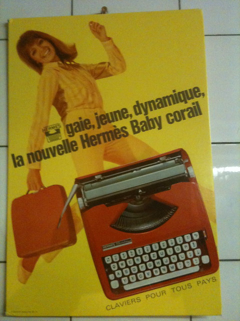
This is a document from approximately 1968, that we found with a pristine Hermes Media 3 that also came with the original brochure stamped with the name of the distributor in Geneva where it was originally purchased. I love typewriter ephemera, and papers like this have been conspicuously absent on most of our finds, so this made me very happy indeed. It shows the font styles available for Hermes machines of the 1958 iteration - this includes the curvy mint green Hermes 3000 we all know and love, as well as the Media 3 and green Baby featured on this site.

Font preference, I have found, is a very personal thing. Most of us cannot choose these days, of course, and all the Hermes machines I have taken in have been because they were available, with the typeface an afterthought. Many of them have been some variant on pica or elite, with the odd "Hermes special" extra-wide spacing thrown in. Script machines are particularly desirable on eBay US and I would love to find a script Hermes too, but no luck so far. (No, I am not at all bitter that here in Hermes-land, where I must have come across twenty of the suckers this summer alone, I have not yet found a single one in script). According to the chart below, script font was available for the Baby, Media 3, and 3000 portable machines only, while the bigger standard typewriters were given variations on pica, elite, and techno.

Hermes typewriters font options

While the first document will have given you a sample of all the font styles, here are the blog posts of a few type-casters who have blogged with some of the different typefaces on Hermes typewriters:

Script: In June 2008, Strikethru described her elation at receiving a script Hermes 3000.

Elite: In September 2008, Little Flower Petals wrote about her attachment to her elite Hermes 3000.

Pica: In May 2008, Olivander composed a free-association poem on a Hermes Rocket (pica?).

Director Elite: This has the spacing of elite, but with more elongated characters. I know Richard would explain it more elegantly!

I had a Hermes Media 3 with this typeface, but I always thought it was much too small. It took so long to fill a page! In June, I wrote about a motorcycle accident I witnessed.

Epoca: The young Line Writer composes his posts on a '70s epoca Hermes 3000.

Techno Pica: In June, I ranted about a Bern museum's glaring lack of typewriters on display using my techno pica Hermes Media 3.

I must be missing many others. Do let me know if you've typecasted on a Hermes typewriter and would like the link to be added to this list!

Friday, August 27, 2010

Triumph Tippa S White Portable Typewriter (1970s)


I am trying my hardest to wean myself of the hoarding phase of typewriter collecting, and I have enough machines now (one would hope!) where I know that I could limit myself to any one of them and type away happily for a good long while. Since I do not get into the intricacies of different linkages and typebar mechanisms, in terms of having a good solid functional machine, I'm set. Several times over, in fact. However, in case I really can't resist, I have (theoretically, at least) limited myself to one category: ultra-portables.


The great thing about ultra-portable typewriters (for me this means not too much larger than 30cm x 30cm x 8cm) is that I can stack them up in my bookshelves and not feel terrible that I have no space to keep them. In fact, even Olivetti's Lettera 32 does not even qualify for this category because it is too long, and neither does our '50s Triumph Tippa (too wide). This plastic 70s Tippa S, however, fits the bill perfectly. Not only is it nice and small, it also has a tab feature (with metal stops that the user sets manually), it is basket-shifted, and there is a carriage lock next to the margin release button. Amazing.


The funny thing is that we already have another Tippa S (labeled Adler, however) that is black with white keys, and so I picked this up on a whim to compare the two. That one, which I suspect is slightly earlier, has a slimmer body but is also carriage shifted, and it does not have tabs. Other than that, they are virtually identical, right down to the keyboard layout. The Triumph/Adler story has been well-documented elsewhere, particularly on Will Davis's site, so I shan't get into it.


Another surprise lurking beneath the hood of this machine was the Techno Pica font. I have long been a sucker for unusual fonts, paying out good money to get script machines shipped to me from Germany. Techno fonts (or Senatorial, as Olympia called them), have been far easier to come by in our typewriter spotting activities. So far we have seen it on a Hermes Media 3 (as per yesterday's typecast), an Olivetti Dora (purchased from Spain), a flea market Brother (which I left behind), a Japy Script (again, sadly unpurchased), and now this Triumph Tippa S.


Next to Elite and Pica, it's becoming rather common to find Techno typefaces in the wild. I am always tickled when I receive a machine expecting it to be another elite or pica and then discover something else. In action, the font of the Tippa S is quite similar to that of the Hermes, although the latter tends to be rather bold and this one has thinner, cleaner lines and a different w and y.


The clamshell-style case is functional without adding any additional bulk, which is perfect. The only weakness is that there is no place to stash papers or even the manual in the case.

For a plastic machine, this is a pretty solid one, and the basket shift puts it squarely in the realm of such classics as the Lettera 32. Great find and ultimately very usable, too.

Tuesday, August 24, 2010

Olivetti Lettera 35 Taupe Portable Typewriter (1970s)


This is a tale of two Lettera 35 typewriters. Here is the one we purchased in Switzerland, with a QWERTZ keyboard, and proudly added to our Olivetti stable. A few weeks later, we spent a weekend in Paris, and what did we discover in the thrift store, neglected and abandoned and incredibly dusty, but another Lettera 35? In the land of azerty keyboards, that one was a qwerty - a Spanish qwerty too, no less, which had somehow made its way to Paris by way of the Venezuelan consulate. What a story! So, we brought it back with us, and that remains our souvenir of the City of Lights.


And so, we now have two identical machines. This notwithstanding, the Lettera 35 is a fine Olivetti specimen - the taupe/ beige body is built entirely of solid cast aluminum. The features are fairly standard for Olivetti-made machines of that period: basket-shifted, tab functionality, and square white keys that are reminiscent of the Underwood 319.


The "rabbit ear" paper support is also classic Olivetti. In addition to the 35, Olivetti would later manufacture a 35L which was the same machine but in a slightly smaller shell.


This is not a light ultra-portable by any means, but it is well-made, solid, and a pleasure to use.


The font is a 10 character per inch pitch serif typeface that I would describe as Roman. The machine writes very well indeed.


In keeping with the rugged nature of the machine in general, the case is also very utilitarian. It reminds me of those shock-proof iPhone cases, only on a much larger scale. Only problem is that it's hard to tell which way is up! Fortunately, Olivetti has etched in a handy little arrow.

Saturday, August 21, 2010

Smith Corona Clipper Black Portable Typewriter (1949)


The typewriter on which I composed my last typecast, this is fast becoming my favorite machine, both to type on and to look at. As with every other U.S. machine I have come across, I was really excited to see this in Switzerland. Another bidder tried to barge in at the last moment, but there was no way I was letting this get away. The few extra francs that I paid were well worth it.


I was smitten with the machine as soon as I ripped apart the box and discovered that classic PanAm logo that typifies the '49 Smith Corona Clipper. The typewriter was very dirty and had obviously lain unused for a long time, but it was otherwise in good shape. Well, it also smelled badly of mold, but I dove in headfirst anyway. Will Davis writes that some of the best U.S.-made typewriters were Smith Corona's Super 5 series (Silent Super, etc), but since I have so far been unable to find those pastel-hued beauties in my neck of the woods, this Speedline series will do just as well.


The curved top and the side profile of this Clipper remind me of other European machines I have seen/ looked at from that era, or even a decade or fifteen years later: Olympia's earlier SM series, Hermes 3000, Triumph Perfekt, Optima Super, and so on. Of course, Smith Corona's own Super 5 series would later continue with this shape.


This is one of the oldest machines I have, as I tend to lean towards the late 50s and 60s in terms of preferred typewriter styles. As a result, this is the only machine I have with glass keys. I must say, writing with this is really quite fantastic. My fingers fit snugly into the scooped tops, and the smooth, cool touch of the glass is a welcome change from the impersonal feel of plastic keys. Afterwards, when I move on to the next line, the swoop of the carriage lever is the perfect shape for a crooked forefinger. Magic.


The font is a perfectly respectable Pica, clean and crisp and easy to read.


And here it is, nestled in its case.

Final impressions: The Smith Corona Clipper was a lot more compact than I thought it would be, from the pictures I had seen. The case takes up slightly less space than the Hermes 2000. In terms of typing action, the basket shift is great to have in a machine of its age, and puts it right up there with the Hermes 3000 and Olivetti Studio 44 in terms of usability. While the black is a tad somber, the aircraft detail lightens it up, and the glass keys look very elegant. I actually find that it fits in well with the twenty-first century aesthetic, while the brash curve of the Hermes 3000 does evoke its era rather strongly.

Collection, this one. No doubt about it.

Tuesday, August 17, 2010

Underwood 19 Ivory Portable Manual Typewriter (1970s)


This is an interesting one. The label may say Underwood, but it was manufactured by the Antares company in Italy who were operating under license from Olivetti. This Underwood 19 is an Antares machine through and through, and despite the label, the form factor and mechanism betray its origins. The four markers behind the margin sets are for setting tabs, and while it may seem crude to have them so visibly on display, I find they are much easier to use, especially for beginners. I would need several hours to figure out and set tabs on my Hermes 2000.


While it may bear some passing resemblance - particularly on the side profile - to a Lettera 32, the Underwood 19 is quite flat (7 cm or 2.75 inches at the thickest part). Like other Antares machines, it is carriage-shifted, in contrast to the Lettera's basket shift. The ribbon-color selection is by means of a very discreet lever next to the ribbon vibrator, in the style of the Japy/ Patria machines. This machine is also very lightweight, as the body is made wholly of plastic. The matte finish on the exterior means that it is scratch-resistant and quite easy to clean.


You don't often find the country of manufacture stamped into the plastic! But this Underwood/ Olivetti/ Antares wants to stand out.


The font is a crisp pica, 10 characters per inch. Typing action is great - no complaints on that front. The square keys are peculiar, but you get used to them quickly.  What you have here is essentially a solid, no-frills machine that may look plain but gets the job done.


 My favorite part, though, is the case. While Olivetti's vinyl constructions weaken with time - and this is no different - the shape of it clearly says "stylish and portable!". The dark brown case with gold-colored accents is really quite aesthetically pleasing and very subtle as well. Not bad at all.


Friday, August 13, 2010

Hermes 2000 Army Green Portable Manual Typewriter (1950s)


When I first saw this color of Hermes 2000 on Alan's site, I was immediately envious. "I've never seen anything like that here!", I thought. Well, never mind. I like this color for the Hermes 2000 instead of the regular old "minty green" because - for me, at least - it evokes a rather macho aesthetic: army jeeps, men in camouflage and combat boots, desert sand and covert operations. With its gruff square lines and brisk, efficient action, this looks like it has a hefty dose of testosterone. Contrast that with the delicately written logo, particularly the "2000", with its dainty loops at the tops of the zeroes:


This is as pristine a machine as we've ever found, and needed little cleaning to get it photo-perfect.


The painted decals on the back have been perfectly preserved, and on the whole this gleams as though it had just come from the shop of Herr Baggenstos.


The case is a tad scruffy, but functions perfectly and is very well-suited to the look of the typewriter. It is square, a sober brown tweed color, wooden with a leatherette cover, and has brown bakelite handles. Very dignified.


By virtue of its very readable pica font, this has now become my new office typewriter. I don't really need a typewriter at work, of course, but I do what I can to add it in to my daily tasks. It is a great conversation piece and draws a smile every time!

Tuesday, August 10, 2010

Underwood Universal Light Blue Portable Typewriter (1950s)


Before Underwood was acquired by Olivetti sometime in the 60s and the name "Olivetti Underwood" appeared on Olivetti's Lettera and Studio models, Underwood was a fine American typewriter manufacturer with a large line of well-respected portable and standard machines, many of which Alan has documented on his site. This Underwood Universal is identical to Alan's, actually, except in a different color and without tab functions.


I was excited to find this machine - until now, my experience with Underwoods has been Olivetti-influenced, and I have read that the Underwood 319 and Underwood 19 have no resemblance at all to the earlier machines manufactured in the USA. So when I snapped open the box and found this gem, I was ecstatic. For all its pedigree, it is also a very good-looking machine.


But then I saw that it had an AZERTY keyboard, and I hesitated. I shall admit that the French layout has always caused me some bewilderment. I have made my peace with QWERTZ these days, but AZERTY? Between all of the keyboard switching, I am rather typo-prone these days. However, despite the keyboard, I was smitten. The machine was in fantastic condition, has an all-metal shell, and a precise, crisp touch. The icing on the cake was when I pressed the "U" logo (which has "Golden Touch" written above it) and this happened:


Just like popping open the hood of a car. On the left is the touch control lever, with five possible settings.

But, back on the subject of typing. The machine has a small, 12 characters per inch elite font:


I find the font crisp and clean, and were it not for the fact that I need to hunt and peck with the azerty keyboard, I'm sure that I could type reasonably fast on this one with no problem. The only thing I am looking into fixing is the type slug for the letter r, which is a bit loose resulting in a weaker impression on the lower part of the letter. A spot of strong glue will fix that, I hope.


The case for the Underwood Universal looks like a piece of vintage luggage, with its wooden frame and brown and ivory vinyl trim. The hinge and handle are sturdy, and although this is a moderately heavy typewriter, the case is perfectly capable of supporting and carrying it.

I am listing this one in the "For Sale" section, as I have other metal-bodied 50s machines with elite fonts and do not have much space for this one. However, this would be a great piece to display and use... I can even see this being used as the "typewriter guestbook" at a wedding, that's how pretty it is! I'll enjoy having it around until it goes, that's for sure.

Saturday, August 7, 2010

Hermes Baby Orange Portable Manual Typewriter (1970s)


The bright orange of this machine would not have worked with my usual orange-sheeted background, so here we have it depicted on a dark wood table. This is the exact same generation as the white Hermes Baby I had previously, except this comes in a much more fun hue. In fact, I saw the original advertisement for this same typewriter when I visited the Perrier Typewriter Museum in Lausanne a couple of months ago, and I did not hesitate to take a picture of it:


Talk about retro tech! Anyway, this took quite a bit of elbow grease to get it cleaned up, but after several hours with cotton swabs, tweezers, and polishing paste, we managed to get the old girl looking spiffy again. You can tell it's seen some good use; the paint has worn off the space bar quite a bit.


Otherwise, it's in fine mechanical condition and ready for a new owner who will put some more mileage on her. Come to think of it, it has been a while since I offered up a machine for sale, so here we go.


 The font on this machine is elite, 12 characters per inch, but she types fairly well, especially after we installed a new dual color ribbon.


 The matching case is also bright orange and is in excellent condition.


Despite my initial doubts, I'm pleased to report that there has been a decent level of interest in the typewriters I have offered to my fellow Geneva inhabitants. Here's to hoping the typewriter comeback is not limited to just the States!

Friday, August 6, 2010

Olivetti Studio 44 Gray/ Beige Portable Manual Typewriter (1960s)

To call this big hulking machine a "portable" is a bit of a misnomer, particularly compared to its kid brother, the classic Lettera 32. Both the Studio 44 and Lettera 32 were produced concurrently in the 60s, and copy from an Olivetti ad featuring both machines reads: "The Olivetti Studio 44 is designed particularly for use in the house, studio, or small office, but is conveniently portable when you desire."


This particular specimen was among those manufactured in the Ivrea plant in Italy, and we were excited to find it in Geneva, but with a Swiss-German keyboard. A sticker on the back indicates that it was originally distributed in Basel. It was in fine condition, save for the usual handful of eraser rubbings that had been sprinkled liberally throughout the case.


There was much rejoicing when this machine joined our Olivetti/ Underwood stable, which includes a Lettera 32, Lettera 35, Dora, Valentine, Underwood 19 (Antares-made), and Underwood 319 (this last is now off to a good home). My Italian husband has a special fondness for Olivetti, predictably, so we had been looking forward to discovering this mid-size Hermes 3000 equivalent, which has received many favorable reviews from Portable Typewriter Forum members.


I have always considered Olivetti cases quite mediocre, and this one is no different. It is an impressive maroon wedge-shaped padded wooden box with a fake leather covering, but the hinge feels rather flimsy in relation to the size and weight of the machine. The handle, also, is rather small and does not particularly inspire confidence:


It looks for all the world like the handles on my plastic Hermes Babies, and I find it hard to believe it would not snap off, especially given the age of the case.


In terms of typing action, the size of the machine lends a long arc to the type slugs, so it writes quite well. As it also has a basket shift, I find a comparison to the Hermes 3000 quite apt. My other minor disappointment is that it has elite font, 12 characters per inch. For some reason, I expect large machines to have large fonts, which is of course hardly true.

In conclusion: Olivetti brand, Italy-made, solid metal construction (but average looks), good typing ability, basket shifted. This one's a keeper.
Related Posts Plugin for WordPress, Blogger...