Showing posts with label ABC/ Cole Steel. Show all posts

Saturday, October 9, 2010

ABC/ Cole Steel Series 3 Ivory Portable Typewriter (1950s)


Last Friday, I received this ABC typewriter, which I had picked up for a bargain on a Swiss auction site (please note that this was before my vow of typewriter chastity, which is still going strong). Anyway, ABCs don’t take up much space, so I figured in the worst case I would put it on a shelf in my bookcase and take it out from time to time, just to admire. In fact, looking at ABC typewriters seems to be the only thing they’re good for, so that worked out.


You see, when I received this machine, the box was rattling ominously. Something was amiss, and once I opened it, the carriage mechanism pretty much fell off in my hands in a hail of screws and washers. This, I did not attribute to careless shipping. I have seen many shipping accidents in my day and they did not involve screws that magically unloosened themselves.


Fortunately, I have another ABC - a series 4 in hammertone green, so I was able to study it and figure out where all the screws, springs, and miscellaneous metal bits had to be re-assembled on this ivory Series 3. Without the template to copy, I would have been up the creek on this machine for sure. It ended up well, more or less - I have determined that the paper finger on this machine is missing for good, after shaking it thoroughly to ensure that it was not just stuck in some crevice.


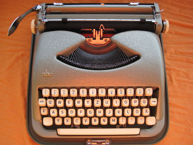
At the end of the day, this Series 3 is remarkably similar to my Series 4. There are small differences: this came in a soft leather-like case (which was shot, by the way), and so the best way to use it is with a typing pad of some sort. The protruding metal tabs on either side of the ribbon cover (which, fortunately, were redesigned in the Series 4) serve as a latch to take off the cover. The ribbon color selector is in the same discreet location, though, and the mechanism seems identical.


The logo, while large and not as subtle as the other version, is still very nice in person - three gold squares in different sizes superimposed by a large uppercase ABC. The gold is very pretty up close. The ivory paint finish is still glossy and remarkably well-preserved (considering the state in which the machine arrived). It makes a nice contrast to the hammer-tone green. This has a typeface of 11 characters per inch, hence slightly smaller than that of the Series 4. Here are the two "siblings":


Vanilla and Sage, I call them. Pretty though they may be, each has its own failings - Vanilla is missing a paper support, has some trouble writing in a straight line, and occasionally skips a letter. Sage, while clean and well-preserved, seems to have been well-used and thus has a worn escapement, which leads to margins that refuse to hold and make it virtually impossible to write a straight paragraph. Both of them have backspace problems... I believe it works intermittently on Sage and not at all on Vanilla.

After the cut, my ode/ rant to ABC typewriters, hastily composed on Vanilla:

Saturday, September 11, 2010

ABC/ Cole Steel Color Schemes (1950s)

As a great admirer of the aesthetic appearance of ABC/ Cole Steel machines, I only regret that I do not have the space to stash more of them! They came in many attractive colors, and if I had my way, I would own all of them! But, apparently some people feel we should be able to live in our apartments and this excludes piling them high with typewriters of all shapes and sizes. Humph.

The next best thing to owning the real items, though, was cobbling together a virtual collection of images from auctions and blogs (credit given where possible). So, here is a full-color tour through the ABC/ Cole Steel typewriter color options. To determine the order in which I present the pictures, I defer to Thomas Fuertig's post on the Portable Typewriter Forum from July 27, 2010, which listed the official names that Kochs Adlernahmaschinenwerke A.G. gave to the various color schemes.

1. Grün (green hammertone)

My own ABC is in this color scheme, so here it is:


2. Green (non-hammertone) - here is a picture I nicked from an eBay Germany auction:


3. Elfenbein (ivory) - here is a picture from user Bergmann on German classifieds site kalaydo.de:


4. Grau (dark grey) - here is a picture from a Portable Typewriter Forum user:


5. Beige (also called Desert Sand in the US) - here is a picture from an expired auction of Galerie Alte Technik:


6. Tomato Red - this picture is of Richard Polt's ABC:


To see more variations, read more:


Wednesday, July 21, 2010

ABC/ Cole Steel Series 4 Green Portable Typewriter (1960s)


Sales of typewriters are slow, and I am chalking it down to summer - everyone's away on holiday, plus it's really hot outside, so who would want to be cooped indoors hunched over a typewriter anyway? Just me, apparently. The plan is to cool off on selling for now and instead rediscover my (over-large) collection, which comprises of the machines I acquired to keep and use and plan to hold on to. (The ones I would like to sell are just as useful, of course, just duplicated in some way - brand, model, or even just font - by others I'm keeping.)


While my venture is on hiatus, there is no reason to let this domain go to waste, so we decided to create a photographic catalog of our modest collection, writing it in the style of our advertisements. Hopefully, this shall be of some use to fellow collectors - and one in particular who is following this blog! So, I shall start off my collection cataloging with this gorgeous ABC typewriter, manufactured by Koch Adlernahmaschinenwerke AG in Bielefeld, West Germany, sometime in the early sixties. 


ABC typewriters are highly-prized for their sleek curves and good looks, and this one is no different. It features a full metal body with a green hammertone finish, and plastic beige keys and platen knobs. According to Will Davis, three variants of this machine were manufactured, the 2- , 3- , and 4- , distinguishable by serial numbers and special features. This is a 4- variant, and so it has an in-built option for changing the ribbon color. I find the placement of the lever, which is close to the carriage on the right, very simple and elegant. 


In terms of typing action, the machine performs well. I am fortunate to have a particularly well-preserved specimen, in that the platen is still in good condition and the typeface comes through clearly. The font is a rather plain and ordinary pica, but it is crisp and readable. The Japy Script (already pictured), white Hermes Baby (already pictured), and Brosette (to come!) all have this same font. It is why I would rather not keep all of them.


I do have a couple of problems with this machine, however: the margins do not always hold (they slip by a space or two every other line), and the line spacing lever shifts the platen up unevenly (sometimes more, sometimes less), so that I have to adjust it myself to create a uniform text. The paper finger, also, does not stay up! (Although I nudged it there for this picture.) I am sure there is a simple solution to this (a missing spring?), so hopefully J will be able to suggest an easy fix. 


That said, this is a great piece of eye candy, and it is nice to type on to boot. It is fairly small, and in the case comes to just under 40cm tall. The case snaps on to the front, and I do appreciate how the bottom of it serves as an impromptu typing pad. Indeed, it is possible to remove the machine entirely from the bottom, but I like it better with, so I leave it on when in use.
Related Posts Plugin for WordPress, Blogger...