Wednesday, September 29, 2010

Adler Tippa S Black Typewriter/ Discursions on Writing


There are times when a great deal arises out of nowhere (misspelled words in the auction and blurry pictures, anyone?), and even though you really shouldn't because you have no space/ it's a plastic machine/ what is the point, you imagine the seller throwing up his hands after the auction ends and tossing the hapless typewriter out with the trash as he mutters to himself, "What the heck, no one wants this anyway."


I couldn't let that happen to her - just look how she gleams! We got this back in June, from a cheerful seller in the Italian part of Switzerland. It's your run of the mill Adler/ Triumph Tippa S, but compared to the other one I have (in white, blogged here) this one is significantly slimmer and carriage-shifted. I am not sure whether the two were made at the same time - they seem similar enough in appearance, but this doesn't have a tab feature.


I'm always amused by just how long the paper fingers on Adler/Triumph machines are. Just take a look. 
Anyway, we also received a special surprise with the machine: blue ribbon! Blue/ red, actually, and happily there was still quite a bit of ink left in it, which I have been enjoying using up. Otherwise, the run-of-the-mill typeface (continental elite, 11 characters per inch) would be much less entertaining.


A closer look at the blue ribbon.

For a writing sample from this Tippa S, find below the beginning of a response I wrote to Deek's question, "Why do you write?". Click here to read the rest of my post over on Type Clack


Monday, September 27, 2010

Olivetti Dora Light Gray Techno Pica Typewriter (1960s)


And so it goes, from script/ cursive to techno pica in the form of this Olivetti Dora. What this is, actually, is the Lettera 32 mechanism with different keytops in a plastic shell. If you look carefully, you might remember where else you might have seen these square black keytops in an Olivetti: the (in)famous Valentine.


We got this from Spain because of the QWERTY keyboard, and it joined the collection sometime in July. While the case is plastic, Beeching's "Century of the Typewriter" confirms that this was made in the mid-sixties together with the Lettera 32. Like the Valentine, the Dora was designed by Ettore Sottsass, and sports simple clean lines (some will find it rather boxy, though).


The plastic is very solid and polishes up to a high gloss. In fact, it takes some careful scrutiny to realize that it isn't metal - it's very well done. This quality declines in the 70s and 80s -the plastic Underwood 319 that we used to have was made of a porous plastic that attracted and retained unsightly stains. And don't get me started on the plastic Tippas! We had a bright orange Contessa de Luxe that reached us with little bits of plastic rattling about the box where the mechanism had proven too heavy for the shell and shattered it. Every collector's worst nightmare.


The Dora was manufactured in Olivetti's Barcelona plant, which would later manufacture most of the Valentine typewriters. Just a cursory glance at the carriage placement and design reveals that Olivetti retained the same basic elements in pretty much every typewriter they made. This includes a basket shift, of course.


Another view of the logo and Spanish characters - upside-down question mark, anyone?

In keeping with its futuristic look and feel, this Dora has a techno pica typeface that completes the theme nicely, don't you think?

Saturday, September 25, 2010

Scheidegger Princess Matic (1950s) with carbon ribbon


And here, some pictures of the machine in question:


The typeface on this one - you know, I'm really not quite sure. When I used it with regular fabric ribbons, it seemed like a print-like Congress* font. With the carbon ribbon, it looks remarkably like the typeface on the Hermes 3000 I wrote with yesterday. So, does that make this director pica? Or is the Hermes 3000 actually Congress*? Intriguing.

*Congress is the name Olympia gave to their print-like typeface.


The Princess 300 typewriter is a German-made machine, manufactured by Keller und Knappich in Augsburg sometime during the 1950s. Scheidegger, however, was the name of a typing school founded by a Mr. Willy Scheidegger in Zurich, and there were many of them all over Europe. In addition to re-branding several Princess 300 typewriters as Scheidegger Princess-Matic for use in the schools, there were also many Triumph Gabriele typewriters that were re-labeled Scheidegger. 


Between this and the wholly plastic Triumph Gabriele typewriter, there really is no comparison. This is 100% solid metal construction, and we were fortunate to score a specimen in great condition, with a Swiss-German keyboard. The bottom of the case is bolted to the typewriter and forms an impromptu typing mat. It is subtle, though, and nicely fitted.


The case is "leather look", and nicely done too, with stitching detail and a sturdy handle.

Friday, September 24, 2010

Typecast: Carbon ribbon test

Or, the one in which I try and fail to emulate Richard. The thing about a carbon ribbon is that it is unforgiving, so it demands precision that I am still trying to master. It can only be used once, and the carbon flakes off if you punch the keys too hard, resulting in the half-formed letters you see on my test page. (On second thought, it might be that the letters are overlapping, which seems to be evident in the detail picture.) But, this is my first attempt and I'll see how it works on other machines besides the Hermes 3000. 

Respooling in progress:


The set-up:


(I believe the font on this Hermes 3000 might be director pica - letters are elite size or slightly larger, but have pica spacing, which explains why they seem to be so far apart.)

Tuesday, September 21, 2010

Thursday, September 16, 2010

Maritsa 22/ Princess 500 Ivory Script Typewriter (1970s)


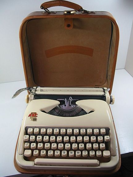
When I first started to have an interest in typewriters, I only wanted one small machine that I could use for filling out forms, and a plastic Hermes Baby fit that bill and did so nicely for one whole year. I assumed the font was standard, what all typewriters came with (now I know it was pica). I did not even suspect there could be other typefaces until I came across Fresh Ribbon's blog and discovered her great variety of whimsically-named script font typewriters. "Smitten" cannot describe how I felt after seeing those beautifully-linked letters dancing across the page. I was immediately on a quest to find my own script typewriter!


And so it was that my first correspondence with other Swiss collectors were frantic appeals to see if any of them had a script machine they would be willing to sell to me. I had seen a large number of script Hermes 3000s on eBay US, and Switzerland being the homeland of Hermes typewriters, I didn't think it would take long before one of those much-adored machines turned up in my backyard. Well, I was wrong. The collectors I wrote to did not have script machines to spare, and Mr. Perrier (of the Lausanne typewriter museum), had some but they were buried so deep in his stock that he could not find them. He told me it would take some time... well, he wasn't kidding - we had that conversation four months ago.


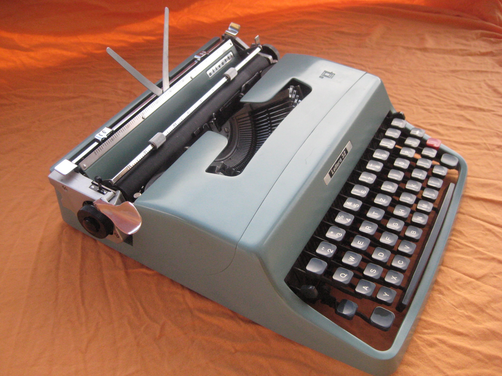
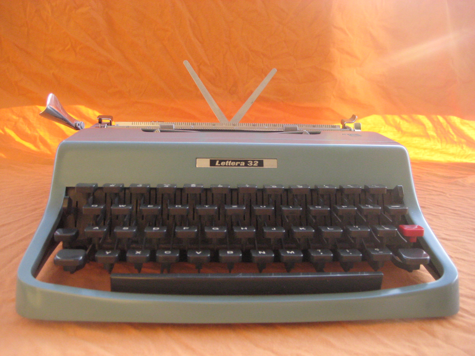
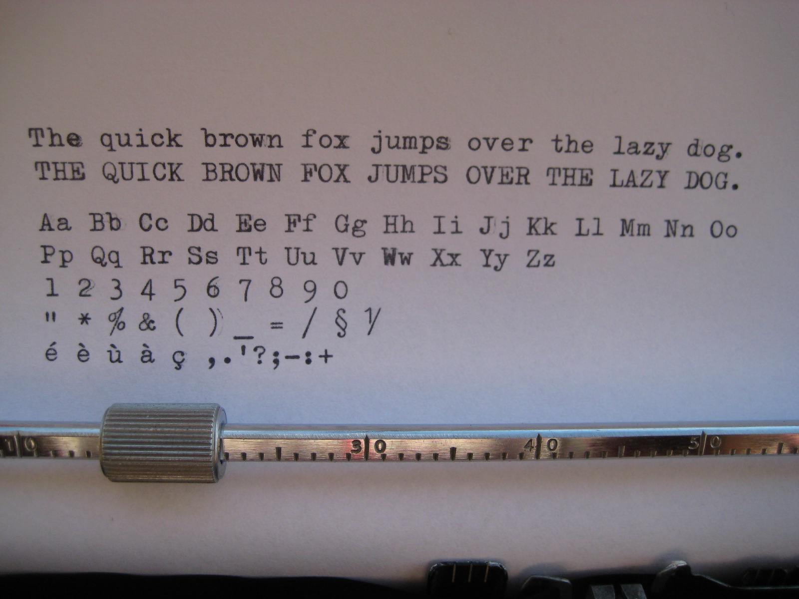
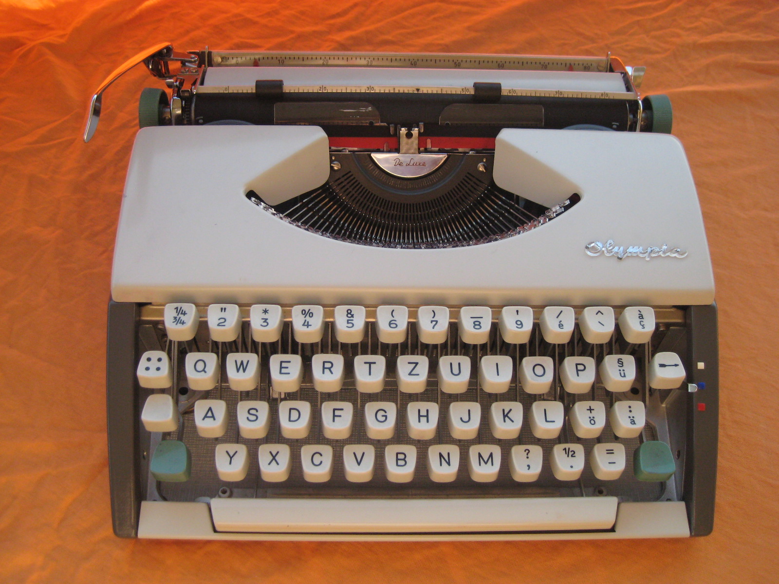
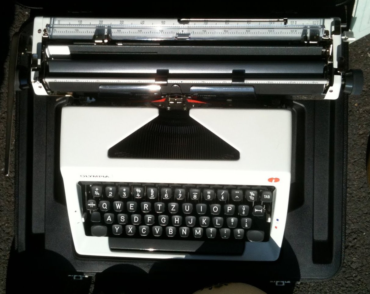
Although I had assured Mr. Perrier that I didn't need a script machine *urgently*, well, I kind of did. The thing about script typewriters is that virtually every major brand had them as an option on their most popular machines, and outwardly, they look precisely like their pica and elite counterparts. So if you are browsing auctions where no one ever offers a picture of a font sample, and hoping to uncover a script machine... well, it's impossible. There is the theory of the "1" key, that script typewriters have a dedicated numeral 1 key where others might not... but I have found non-script machines with the "1" as well. I bought a Japy Script hoping it would be, well, script... no luck. I pored over auction pictures of machines I knew had been manufactured with script typeface as an option... Olympia SM3, SM7, SM9, Splendid 66, SF, and Traveller Deluxe, Olivetti Lettera 32, Adler Tippa S, Hermes 3000 - all for naught. I was flying blind and did not want to risk paying expensive shipping costs and getting another pica. Heck, I did risk it a couple of times - and it never paid off.


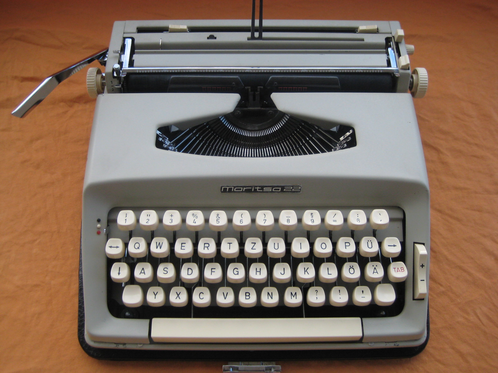
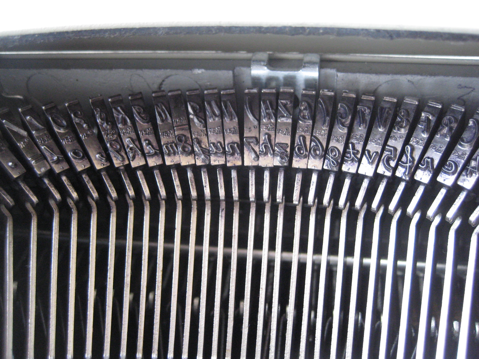
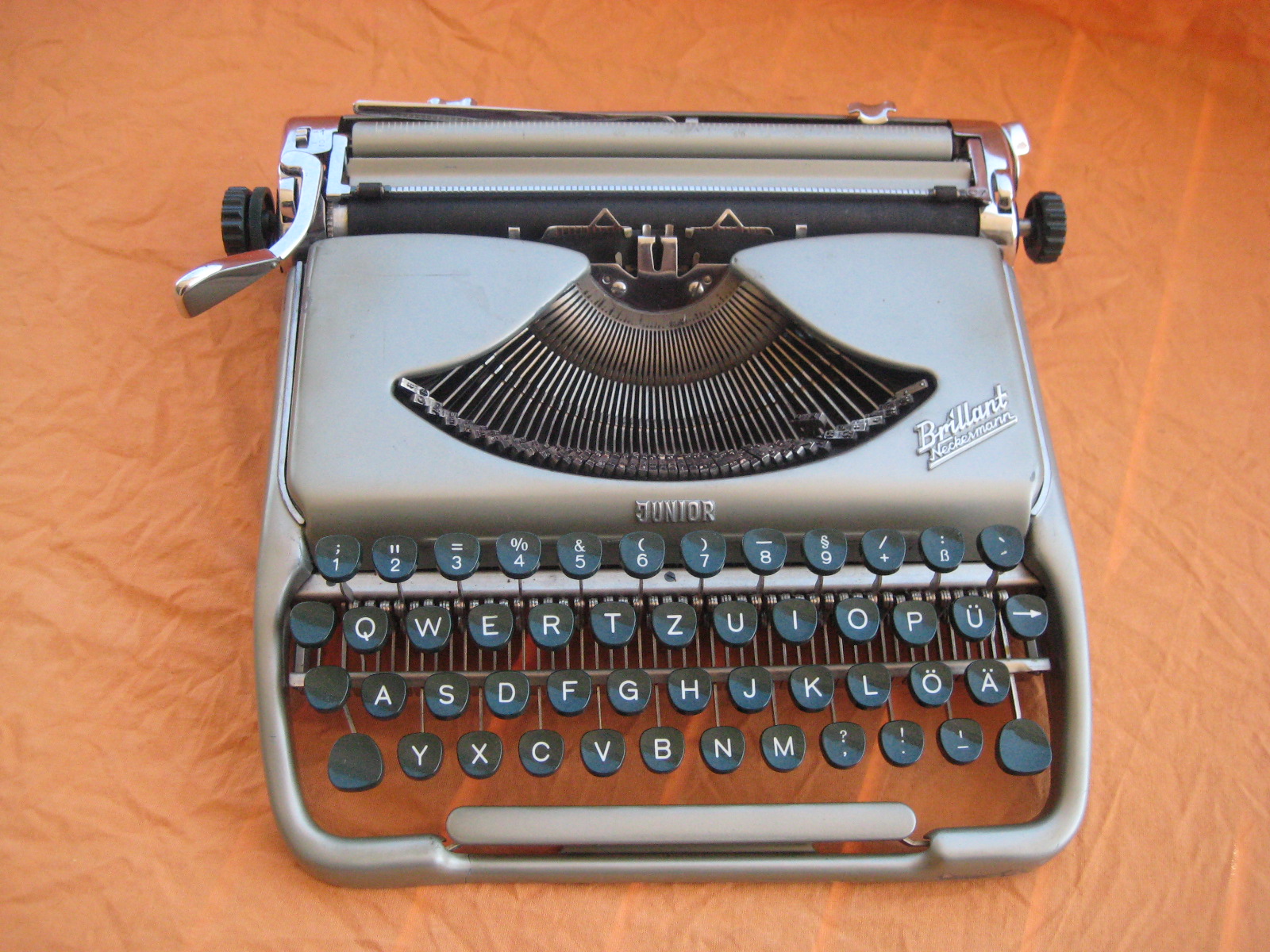
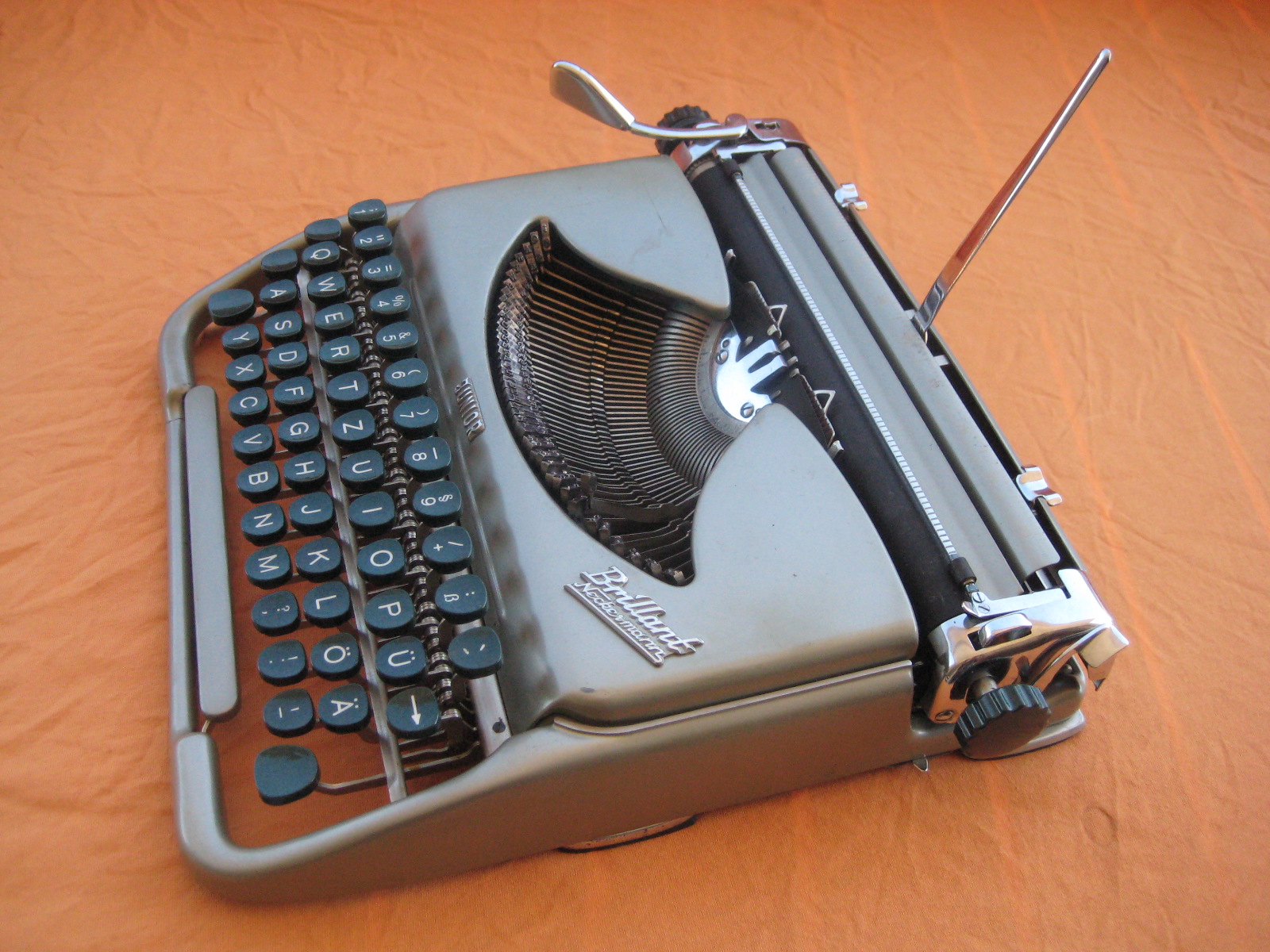
Finally, it sunk in that the only way I could ensure that I would be getting a script machine was if the seller had specifically mentioned it in the auction. Otherwise, I would end up with a houseful of duplicate machines in every typeface but. So, I waited, and finally, a Triumph Gabriele 10 turned up on eBay in Germany. It was a hideous bulky yellowed plastic thing, but I wanted it anyway, and I got it. And it was script, and I was enthralled, but the machine was no less hideous to behold for its graceful lettering.  So, when this Maritsa 22 turned up a couple of months later, I leapt in to bid. I did not see much beyond the macro picture of the type slugs included in the auction (reproduced above), as well as a 30-year-old typing sample that the seller had provided. If I had read further, I would have noticed that the seller clearly stated that the machine was "completely stuck" and "NOT WORKING".


I was outbid at some point, but I was obsessed and bid again, higher. Finally, the auction was over, and the script typewriter - one with a solid metal body, at that - was mine. Victory!

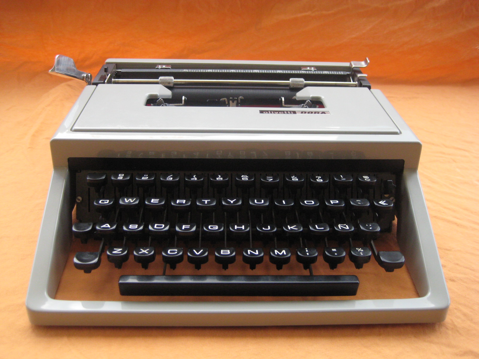
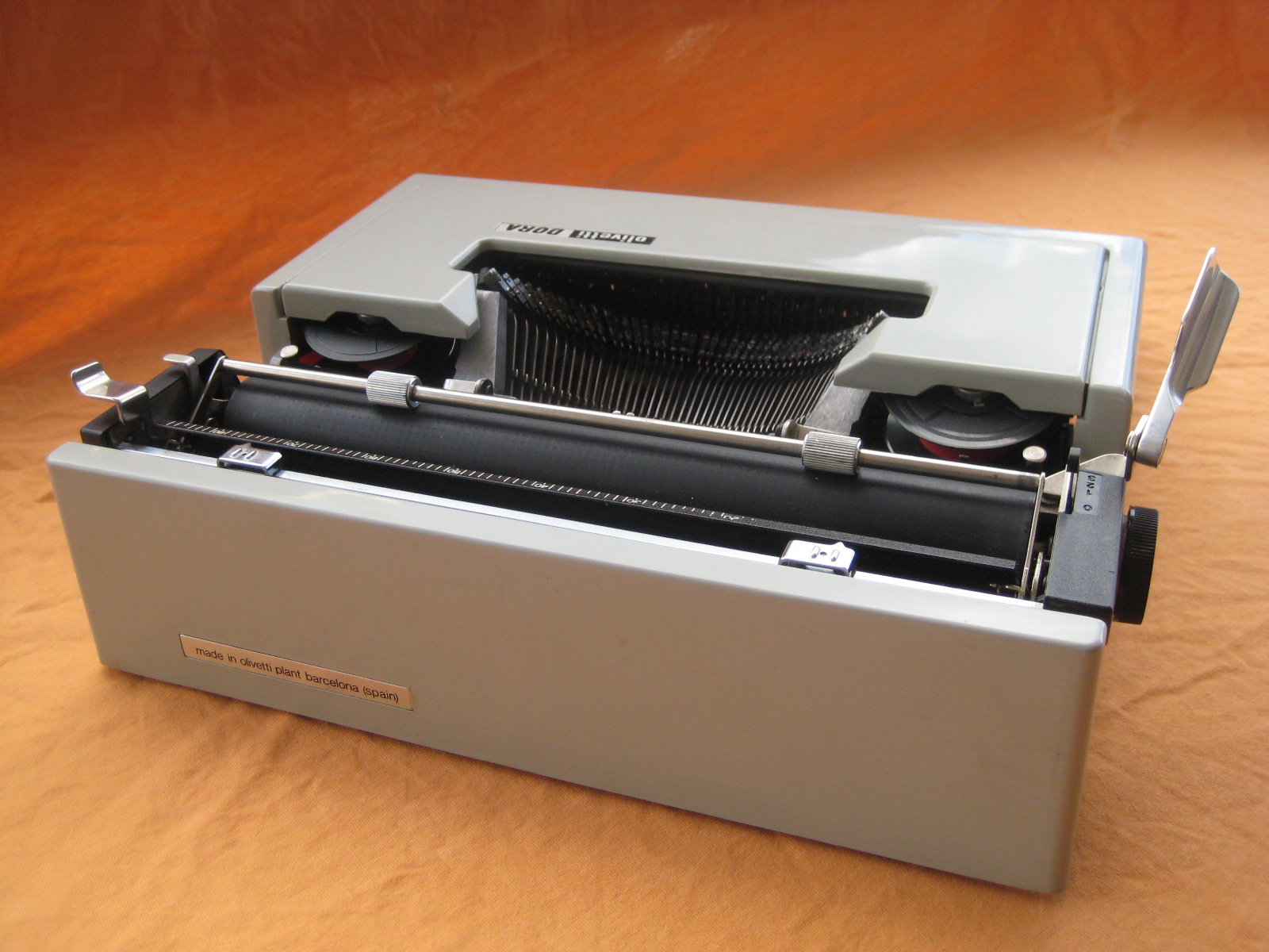
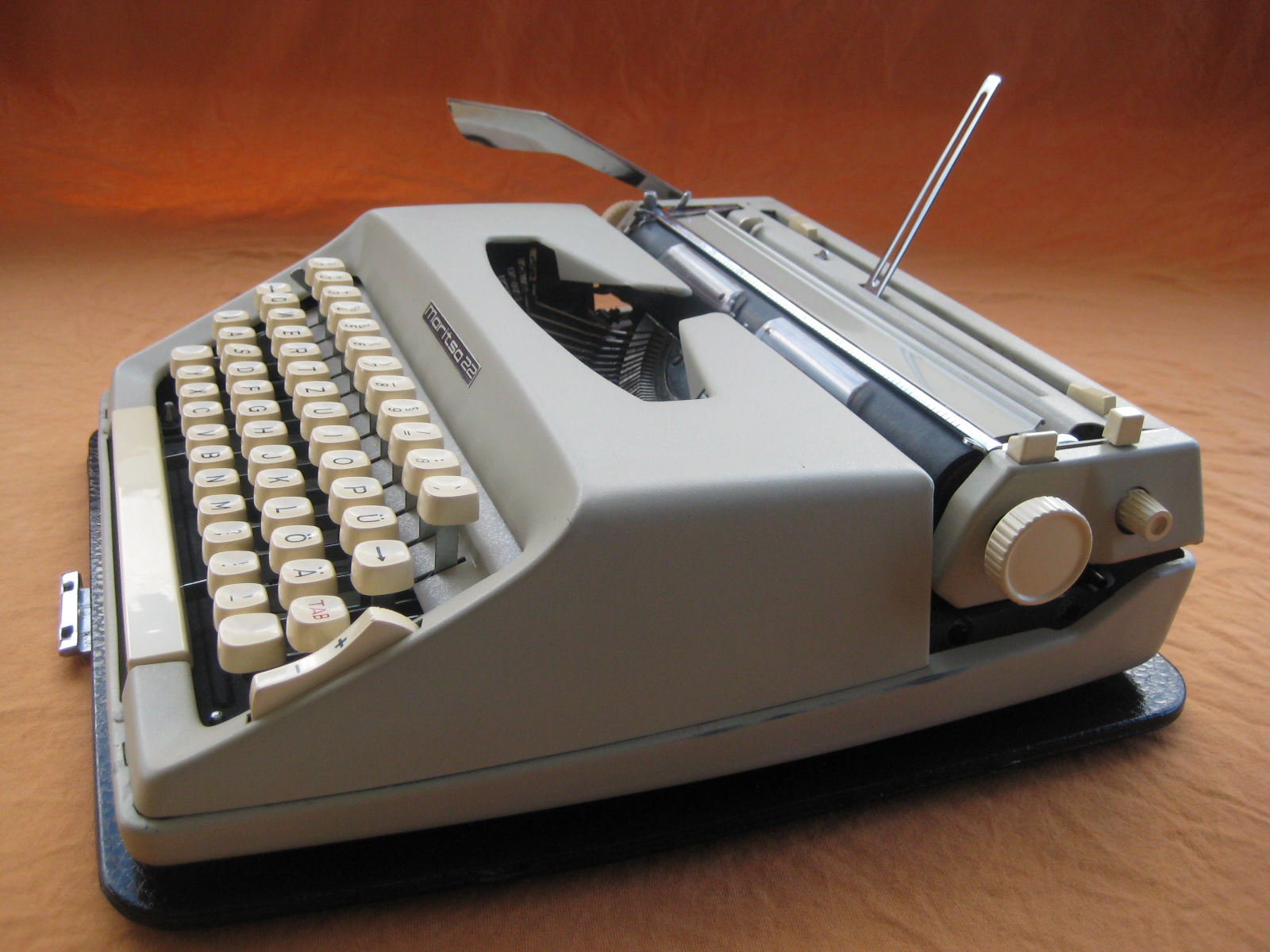
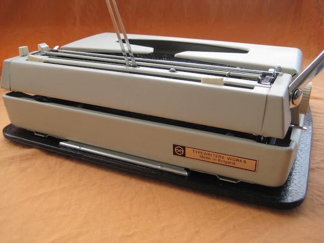
But first, a little introduction to the Maritsa 22: It was built by Typewriter Works in Plovdiv, Bulgaria, and is a slightly re-engineered version of the German Princess 500 built by Keller und Knappich. Typewriter Works produced their own versions of the Princess machines for several years, and you can read about the progression of various models and the comparison between Bulgarian and German machines on Will Davis's site.


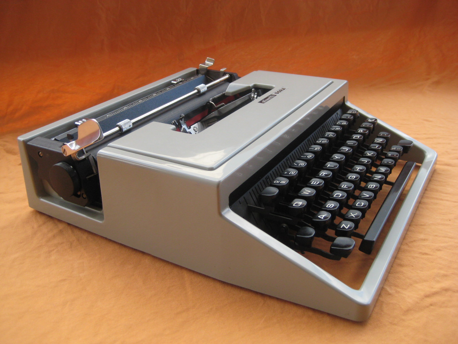
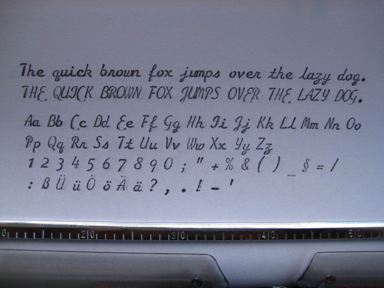
As an owner of a Princess 300 (re-badged, however), I shall freely admit that this Maritsa 22/ Princess 500 is a step back in terms of design - not only is it significantly larger and heavier, but it is also carriage-shifted! Talk about inefficiency. However, those descending capitals (look at the C and E!) make me swoon, so I shall have to grin and bear it.

When the typewriter arrived in all its flimsily-packaged glory, it was indeed firmly stuck. The keys could barely be depressed, and they barely lifted out of the type basket, let alone getting to the platen. The beautifully etched type slugs mocked me. I was desperate - and so I did a dip and dunk, hoping to get out accumulated grease and dirt. Several hours later, it was clean and dry, but still refused to type.

Sensing I was mere moments away from throwing the whole thing in the dumpster, I permitted my husband to go ahead with drastic action, applying a chemical that sends shudders down the spines of typewriter-repairmen everywhere: WD-40. Oh, yes. That took a good hour of lubing and manipulation, but at least by the end of it, it worked! And it still does.

If the worst comes to pass and everything I have read about WD-40 being poison to typewriters turns out to be true... well, this isn't a priceless collectible or anything, so it won't hurt too much if it dies. But while it is alive, I have my friends and family admiring my flawless penmanship, and I can read script casts in the typosphere without being consumed by envy. Which, really, is all I wanted.

Tuesday, September 14, 2010

Typecast: Vicarious Gardening


Never mind the ferocious hound scrabbling for arugula. Another picture without the hound, from the garden's early days:


Sunday, September 12, 2010

Olivetti Lettera 32 Blue Portable Manual Typewriter (1960s)


The Olivetti Lettera 32 was a popular machine for good reason: it is well-built with a full metal body, writes briskly, and is one of the most compact basket-shifted machines available. It is also distinctive and easily recognizable, in its classic blue shell. Now that it will always be known as Cormac McCarthy's typewriter, I am sure no one will be forgetting Marcello Nizzoli's design anytime soon.


This one is in beautiful condition, with a Swiss-French QWERTZ keyboard and immaculate chrome accents; not a speck of rust to be found.


As much as I love this beautiful machine, it has the same font as the Studio 44 which I slightly prefer, so I shall put this one up on the block. Besides, we also have a Lettera 22 (actually a Pluma 22, which I shall feature soon), and the two are virtually identical - the Pluma is just a hair smaller.


This is part of the first batch made in Olivetti's plant in Ivrea, Italy. Our Studio 44 also hails from that esteemed factory.

Speaking of factories, we are on a quest to find and visit Paillard's old premises in Yverdon and see how the old Hermes premises have been transformed since the factory closed. That should be interesting.

Anyway, back to the Lettera 32. The font is elite (12 characters per inch):


After the jump, a picture of the Lettera in its soft vinyl case:


Saturday, September 11, 2010

ABC/ Cole Steel Color Schemes (1950s)

As a great admirer of the aesthetic appearance of ABC/ Cole Steel machines, I only regret that I do not have the space to stash more of them! They came in many attractive colors, and if I had my way, I would own all of them! But, apparently some people feel we should be able to live in our apartments and this excludes piling them high with typewriters of all shapes and sizes. Humph.

The next best thing to owning the real items, though, was cobbling together a virtual collection of images from auctions and blogs (credit given where possible). So, here is a full-color tour through the ABC/ Cole Steel typewriter color options. To determine the order in which I present the pictures, I defer to Thomas Fuertig's post on the Portable Typewriter Forum from July 27, 2010, which listed the official names that Kochs Adlernahmaschinenwerke A.G. gave to the various color schemes.

1. Grün (green hammertone)

My own ABC is in this color scheme, so here it is:


2. Green (non-hammertone) - here is a picture I nicked from an eBay Germany auction:


3. Elfenbein (ivory) - here is a picture from user Bergmann on German classifieds site kalaydo.de:


4. Grau (dark grey) - here is a picture from a Portable Typewriter Forum user:


5. Beige (also called Desert Sand in the US) - here is a picture from an expired auction of Galerie Alte Technik:


6. Tomato Red - this picture is of Richard Polt's ABC:


To see more variations, read more:


Wednesday, September 8, 2010

Olympia SF De Luxe White Portable Typewriter (1960s)


The Olympia SF (Schreibmaschine Flach) is one of those ultra-portable machines that has received rave reviews from typewriter users. It sports all-metal construction, and the turquoise keys on this particular model make it a dead ringer for the classic early Olympia SM-9, albeit smaller. The SF is often mentioned in the same breath as the Smith Corona Skyriter and the Hermes Baby/ Rocket, as a typewriter that is both truly portable and pleasant to use.


The Olympia SF appears to be a direct descendant of the earlier small Olympia portables, which were labeled Splendid 33, Splendid 66, and Splendid 99 in Europe, and in the States was seen occasionally branded as the Olympia Socialite. The SF is boxier than those earlier models, and the rounded corners have been sharpened here. The side profile is also reminiscent of its larger sibling, the SM-9, especially with the combination of green, white, and dark gray colors. The Olympia SF is carriage-shifted (unfortunately), but this is pretty standard operating procedure for machines this size.


Between this and the Hermes Baby, I would still go for the Hermes, which is sparse and tight. The Olympia SF has a number of nice features, including the red margin indicators which are visible beneath a transparent plastic covering the ruler. However, this particular specimen has caused me some grief with the ribbon: it stretches so taut that I have to adjust it from time to time with my finger. I am due to receive another of these machines in the next few weeks, and I shall then be able to judge whether the problem is with all SFs, this one only (perhaps a missing spring?), or me (assuming there is some super special way of replacing the ribbon that I did not observe).


For all its faults, I find the fault on this SF rather charming. It is a huge 10 cpi that Olympia probably designated "Roman", but it reminds me most of the American Typewriter font that comes pre-installed on Macs. I remember when I first got a typewriter, I thought to myself that the font looked nothing like Apple's interpretation, but now I can see where they got their inspiration... dead ringer, really. The alignment is a little wonky, and the margins slip every so often, so some more tinkering is probably in order. Other than that, this is a nice little machine and I hold on to it in hopes that I might someday be inspired to wax lyrical about it as others have done before.

I'm still looking forward to trying out a full-size Olympia, probably the much-acclaimed SM-9, at some point. We spotted an SM-8 while out "hunting" some weeks ago, but passed it over because of the wide carriage, although the price was very reasonable. Here's a picture I took then:


Not bad, eh? I would, however, like an older model because I'm a sucker for the Olympia logo rendered in script font. I haven't seen this SM-8 since - like all the machines I leave behind, I hope it found a good home!

Saturday, September 4, 2010

Neckermann Brilliant Junior, or Groma Kolibri (1950s)


Reading Richard's post about the patron saint of typewriter collectors, St. Vincent de Paul, which he composed on a beautiful Groma Kolibri, I was reminded of my own ill-fated attempts to procure one of these ultra-flat beauties. The Neckermann Brilliant Junior above is a Groma Kolibri, rebranded and sold by Neckermann (a large department store in Germany. This is pretty much the equivalent of Sears rebranding Smith Corona typewriters in the States.).


 Of the many typewriters I have purchased online and had shipped to me, this is the only one that didn't make it. How ironic that it should also be the smallest! Perhaps that has something to do with it. See how the bottom is no longer level? We think the right side was dropped heavily at some point, causing the hairline crack right under the left side of the space bar. That is actually broken. So sad! What has happened, and is beyond my technical knowledge to repair, is that the space bar and keys no longer move the carriage - it moves freely on its own, but the escapement is jammed somehow and pushing a key does not trigger a carriage movement like it should.


Couldn't have happened to a more handsome machine. The worst part of it is that this was the one machine I had delivered to a friend to save shipping costs (she lives in France and it's cheaper to send German purchases there as it's still in the EU whereas Switzerland is not), and so I have no idea of how it was packaged, as I asked her to discard the box and packing materials. I had not thought there would be cause for concern... in the past, everything has gone fine. Well, now I join the throngs of collectors with shipping horror stories.


Here is the case which, although in decent condition, cannot be recycled for another machine because it is much too small. The Groma/ Neckermann now lives its days as our display typewriter,  hoisted up on the bookshelf. It looks rather nice up there; but of course I would much prefer it to be functioning! I'm much too scared to try getting another, at least for a while, so this will remain as my only experience with the much-sought after Groma Kolibri, unless I come across one locally (fat chance!). Ah, well. Win some, lose some.
Related Posts Plugin for WordPress, Blogger...